Websites · November 7, 2026 · 5 min read
How to add calls to action to your website that get clicks
Most small business sites don't tell visitors what to do next. Here's where to put calls to action, what to say, and how many you need.
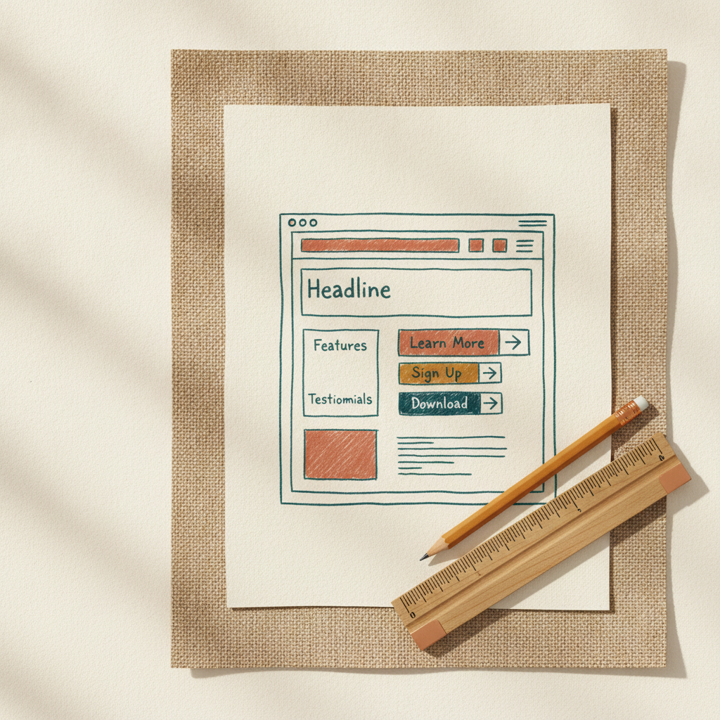
Most small business sites bury the next step. A visitor reads your services page, thinks "okay, now what?", and leaves. A call to action (CTA) fixes that by telling people exactly what to do next.
What a call to action actually is
It's a button or link that asks for one specific action. "Call us for a quote." "Book a free estimate." "Get the price list." That's it.
A CTA isn't a menu item or a vague link like "Learn more." It's a direct request, and it should match what the visitor is ready to do at that moment.
Someone landing on your homepage for the first time isn't ready to hire you. Someone reading your pricing page probably is. The CTA on each page should reflect that.
Where to put them
You don't need CTAs everywhere. You need them in the spots where people already make decisions.
Top of the homepage. Put your main CTA above the fold, meaning visible without scrolling. If a plumber's site opens with a headline and a photo but no phone number or button, that's a missed click.
End of every service or product page. After someone reads about what you do, give them the next step right there. Don't make them hunt for the contact page.
The header. A button in the top corner (like "Get a quote") stays visible as people move around the site. On mobile, a tap-to-call button here is worth the space.
The footer. Some people scroll to the bottom looking for contact info. Repeat your main CTA there.
Contact page. This one seems obvious, but plenty of contact pages are just an email address in small text. Add a short form or a clear button.
What to say on the button
Be specific and use verbs. The button should finish the sentence "I want to..."
Weak CTAs:
- Submit
- Click here
- Learn more
- Contact
Stronger CTAs:
- Get my free quote
- Book a 15-minute call
- Call (555) 123-4567
- See pricing
- Download the checklist
A few rules that help:
- Say what happens next. "Book a call" is clearer than "Get started." Visitors hesitate when they can't tell what they're signing up for.
- Lower the stakes when you can. "Free estimate" or "No obligation" removes some of the friction.
- Match the page. A CTA on a pricing page can be bolder than one on a blog post. On a blog post, "Get the free guide" often works better than "Hire us."
- Keep it short. Two to five words on the button. Put any extra explanation in a line of text beside it.
How many calls to action you need
One primary CTA per page. That's the action you most want visitors to take, whether that's calling, booking, or buying.
You can add a secondary CTA for people who aren't ready. If your main one is "Book a consultation," the backup might be "Download our price guide." Make the secondary one look quieter: a text link or an outlined button, not a second bright button competing for attention.
If you have five buttons all shouting for a click, visitors freeze or pick none. Choose the main thing and design the page around it.
Make the primary CTA stand out visually. Use a color that contrasts with the background, leave white space around it, and keep it the same style across the site so people learn to recognize it.
Test it like a normal person
Once your CTAs are in, check them:
- Open your site on your phone. Can you find the main button without scrolling or squinting?
- Click every button. Does each one go where it says it will?
- Submit your own contact form. Does the message actually arrive, and how fast?
- Ask a friend to look at your homepage for five seconds, then ask what they'd do next. If they can't answer, the CTA isn't clear enough.
After a month or two, look at which pages get visits but no inquiries. Those pages are where to try different wording or placement. Change one thing at a time so you know what worked.
Takeaways
- Every page should ask for one specific next step.
- Place CTAs at the top of the homepage, the end of service pages, the header, the footer, and the contact page.
- Use action verbs and say what happens next. Skip "Submit" and "Click here."
- One primary CTA per page, with at most one quieter backup.
- Test on your phone and submit your own forms to make sure everything works.
If your CTA is "Email us" and your address ends in a free webmail domain, that can undercut the trust you're trying to build. Setting up professional email on your own domain, through GoDaddy at domainsbysynergy.com, gives your contact button a more credible address behind it.
Up next
Previous · Trust
How to respond to positive online reviews (and why to)
A good review deserves a reply. Here's how to write short, genuine responses that build trust with the next customer reading them.
Next · Websites
How to choose a website color palette that fits your business
Pick three or four colors, test them for readability, and stop second-guessing. Here's a simple way to settle on a palette without hiring a designer.